Thursday, 8 May 2014
Evaulation: Question Four
How did you use media technologies in the construction and research, planning and evaluation?
Evaluation: Question Three
What have you learnt from your audience feedback?
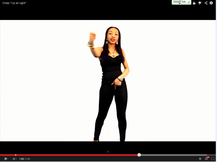
After gathering our audience feedback we analysed it as a group and considered the ways in which we could make changes to our music video from the feedback we received. One of the main criticisms was the white space left on our green screen footage where we just had an artist on a white background rapping the lyrics to there verse. After receiving this feedback we as a group decided the most effective option was to add in text consisting of lyrics that would pop up around the artist as both he/she raps. Once doing this, although it wasn't conventional, we decided it was another aspect that was successful in allowing the audience to interact with the song as the the lyrics was now on screen.
Evaluation: Question One
In what way does your music video use, develop or challenge forms and conventions of real media
I've chosen to answer this question with 9 key frames. Here are the 9 key frames I have filled out: Below are the screenshots that i have uploaded in relation to the grid,I chose to upload these so that the images could be viewed more clearly and wouldn't be squashed within the grid.
Tuesday, 6 May 2014
Advertisement Changes
After analyzing the final advertisement as a team we decided the inital picture whereby we had 'chidz' surrounded by two girls gave the impression that we was advertising a group rather than a single artist, because of this we decided to change the picture to a single shot of 'chidz' to make it clear it was a solo artist advertisement rather than a group. We also decided to make the chidz logo larger as it was very much the same size as the money dance writing below it and didn't stand out as much as we felt it should of, we experimenting with the colours of the logo as can be seen above where the chidz logo is gold rather than black and gold however as a group we decided we preferred the black and gold as it fitted the house style of the advertisement better. We also decided to change the 'now available on itunes' words to an actual branded box of itunes to include iconography on our advertisement and make our advertisement more conventional.
Friday, 2 May 2014
Subscribe to:
Comments (Atom)


